In the world of branding and design, colour is far more than a mere aesthetic choice. It’s a powerful communication tool that influences mood, conveys messages, and drives consumer behaviour. Understanding colour psychology is essential for brands striving to make a lasting impression. This exploration delves into the art and science of selecting the perfect colour palette to elicit specific emotional responses and forge a deeper connection with your audience.
The science behind colour psychology
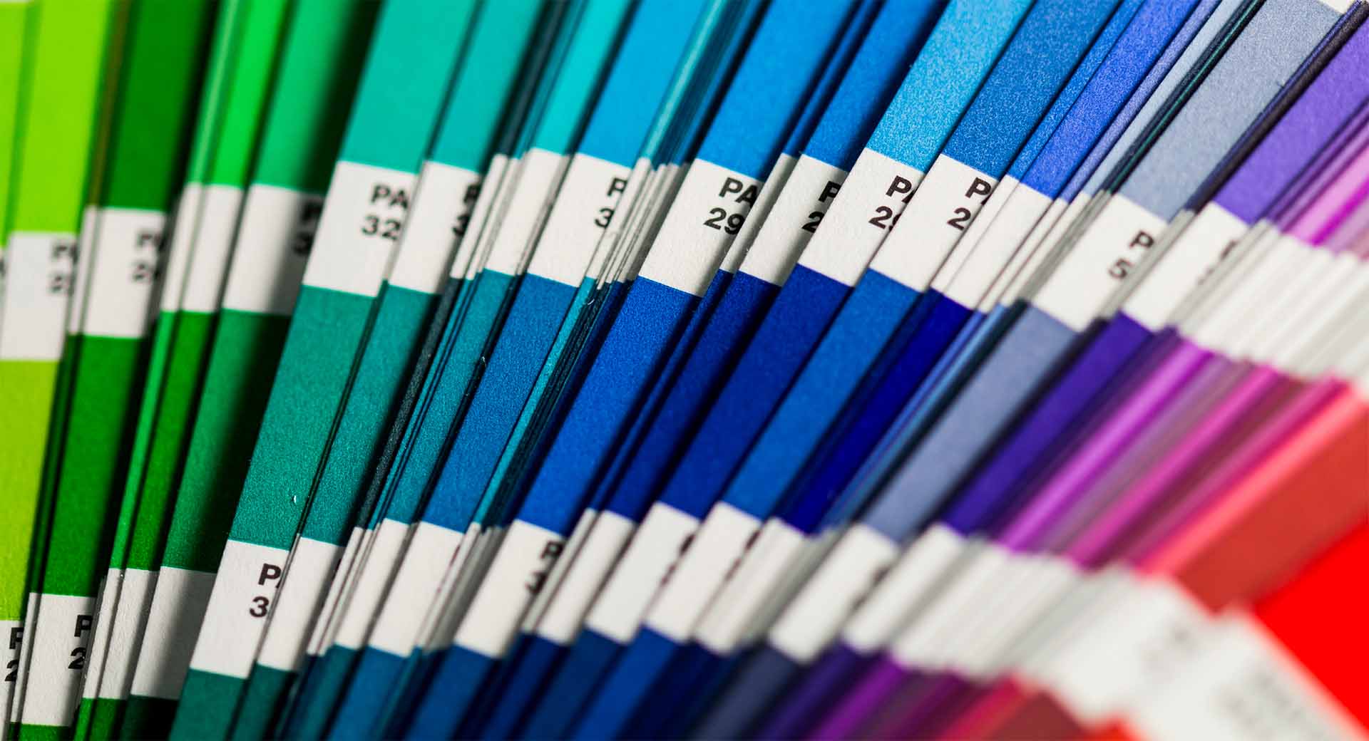
Colour psychology is rooted in the way colours impact our perception and emotions. Different hues can evoke various feelings and reactions, a phenomenon backed by numerous studies in psychology and marketing. For instance, warm colours like red and yellow often stimulate feelings of excitement and optimism. In contrast, cool colours like blue and green are calming and reassuring.
Harnessing colour for brand identity
Your brand’s colour palette is a pivotal element of its identity. It’s not just about looking good; it’s about feeling right. The colours you choose can significantly influence how your brand is perceived and can be a decisive factor in attracting and retaining customers.
- Red: The colour of energy and urgency
Red is a powerful colour often associated with energy, passion, and urgency. It’s commonly used in branding to grab attention and encourage action. Think of clearance sales and ‘buy now’ buttons. However, overuse can be overwhelming, so balance is key. - Blue: Trust and serenity
Blue, a universally beloved colour, conveys trust, reliability, and stability. It’s a popular choice for financial institutions, technology companies, and healthcare providers, as it evokes a sense of security and professionalism. - Green: Growth and harmony
Green, the colour of nature, symbolises growth, health, and harmony. It’s an excellent choice for brands promoting organic, sustainable, or wellness-focused products. Green is soothing to the eye and communicates a message of environmental responsibility. - Yellow: Optimism and clarity
Yellow, the brightest colour on the spectrum, is synonymous with optimism, clarity, and warmth. It’s effective in drawing attention and creating a sense of happiness and energy. However, it’s best used sparingly to avoid visual fatigue.
Understanding cultural context
It’s crucial to consider cultural differences in colour perception. Positive and appealing colours in one culture might have negative connotations in another. For instance, while white symbolises purity and peace in many Western cultures, it’s associated with mourning in some Eastern cultures.
Crafting an emotionally resonant colour palette
Creating a colour palette that resonates emotionally with your target audience is both an art and a science. Here are some steps to guide you through this process:
- Analyse your brand personality: What emotions do you want your brand to evoke? Sophistication, excitement, trustworthiness? Your colour palette should align with these core brand attributes.
- Research your audience: Understanding your audience’s preferences and cultural backgrounds is vital. Different demographic groups may respond to colours differently.
- Test and iterate: Experiment with different palettes and gather feedback. A/B testing on your website or marketing materials can provide valuable insights into what works best with your audience.
- Be consistent: Once you’ve chosen your colours, use them consistently across all branding materials. Consistency helps in building brand recognition and trust.
The power of colour combinations
It’s not just individual colours but also their combinations that create impact. Complementary colours (opposites on the colour wheel) can make your branding pop. In contrast, analogous colours (next to each other on the colour wheel) offer a more harmonious look.
Avoiding common pitfalls
Beware of trends that may not align with your brand identity. Also, too many colours can lead to a confusing and unprofessional look. Aim for a balance between being distinct and maintaining simplicity.
In summary, choosing the right colour palette is a crucial step in branding, capable of making your brand more memorable, relatable, and emotionally engaging. By understanding the psychology behind colours and applying these principles thoughtfully, you can create a brand identity that stands out and resonates deeply with your audience’s emotions and values. At Crux, we excel in harnessing the power of colour to craft brand experiences that captivate and endure. Let’s paint a brighter future for your brand together.
If you found this article interesting and would like to talk to us about a new project get in touch.