Client: Biaco
Industry: Energy
Sector: B2B & B2C
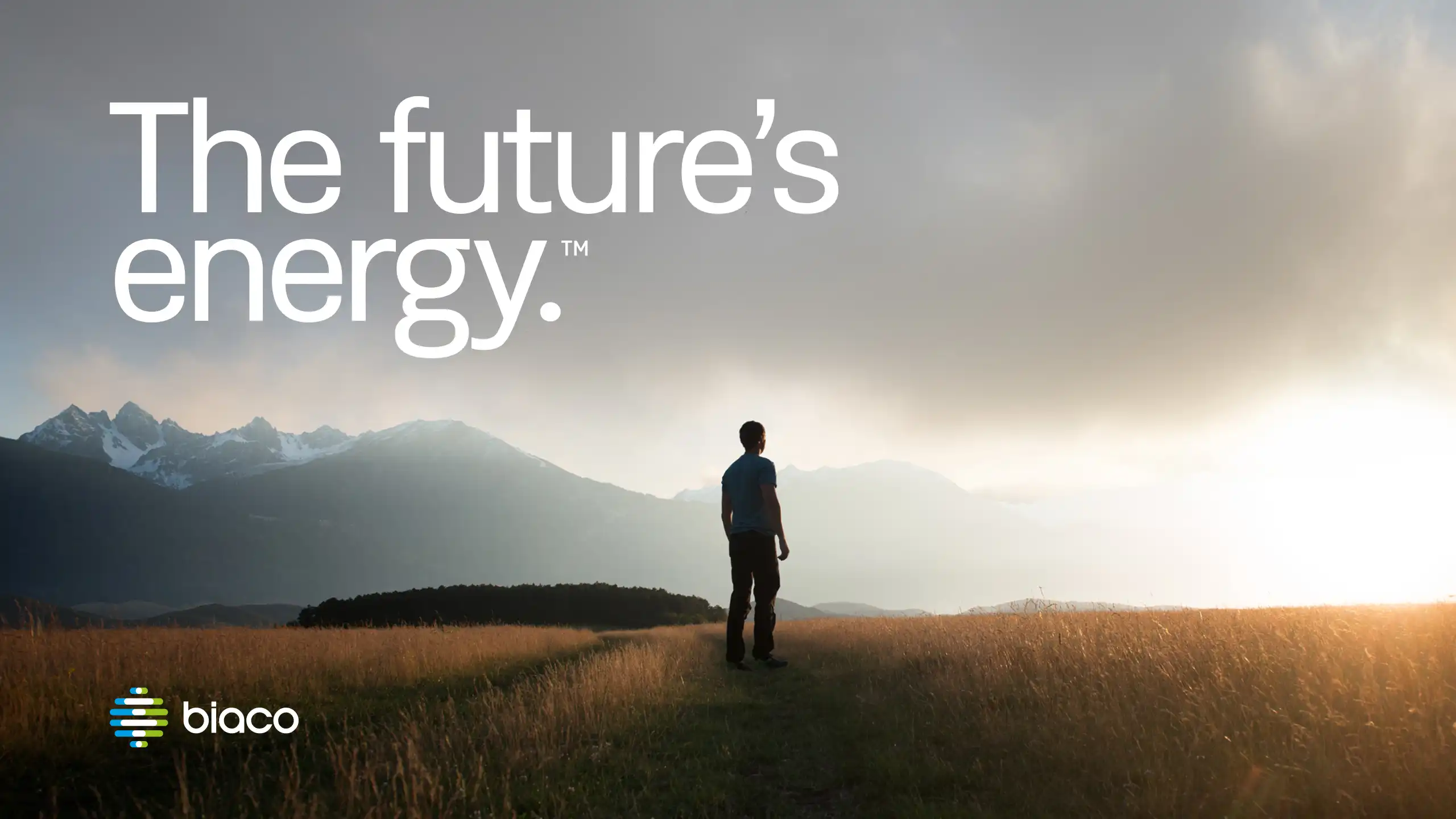
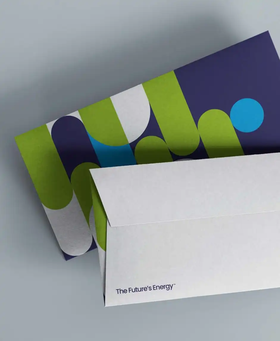
The Future’s Energy™
Overview
Biaco Energy is a new force in the sustainable energy sector, a company built around innovation, responsibility and a vision for a carbon-free future. From strategy and naming to brand identity and guidelines, Crux built the Biaco brand from the ground up, creating a bold, confident presence for a new kind of energy provider.
This was brand creation built on clarity, purpose, and ambition, defining a challenger ready to help lead the energy transition.


Our approach
The clean energy space is crowded with repetition, green leaves, blue gradients, and endless claims of sustainability. Biaco wanted something different. They weren’t just another renewable start-up; they were a company driven by innovation and integrity, built to move the industry forward.
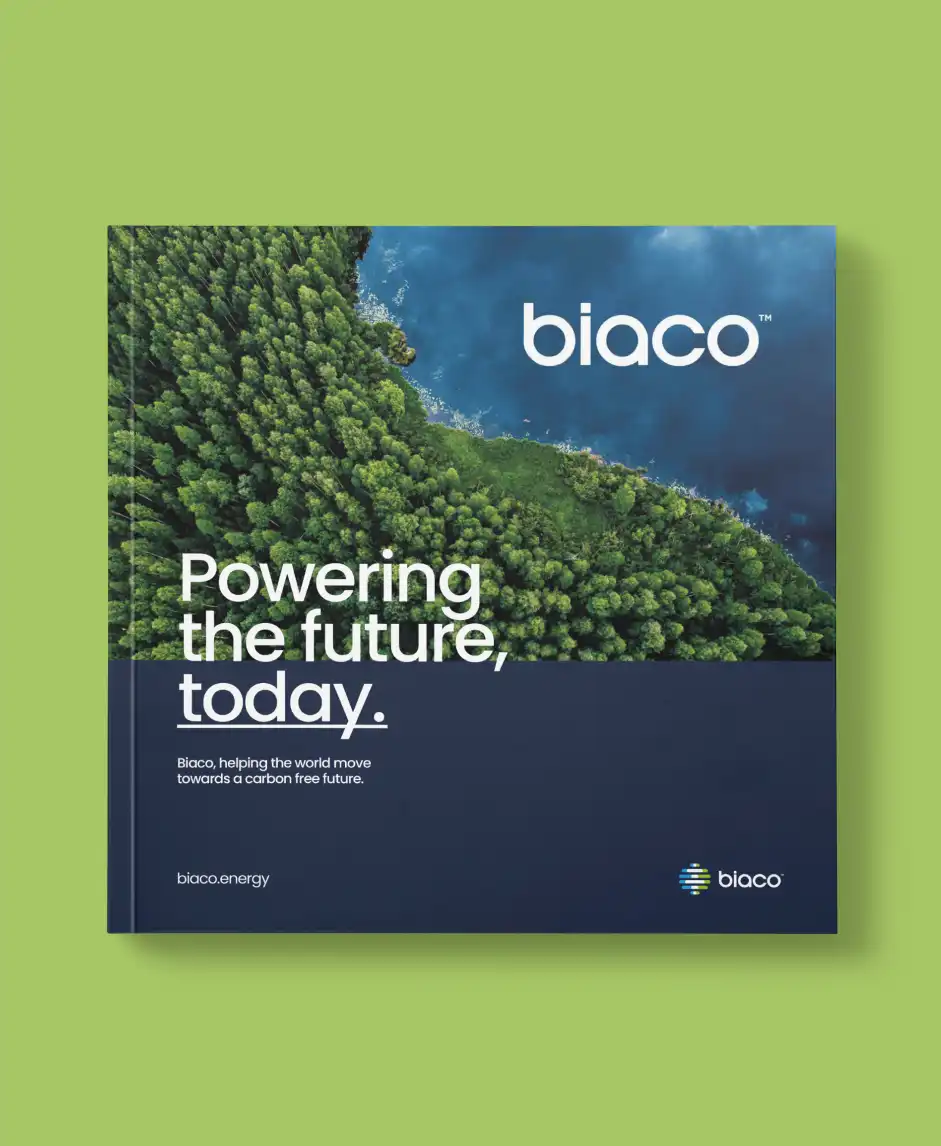
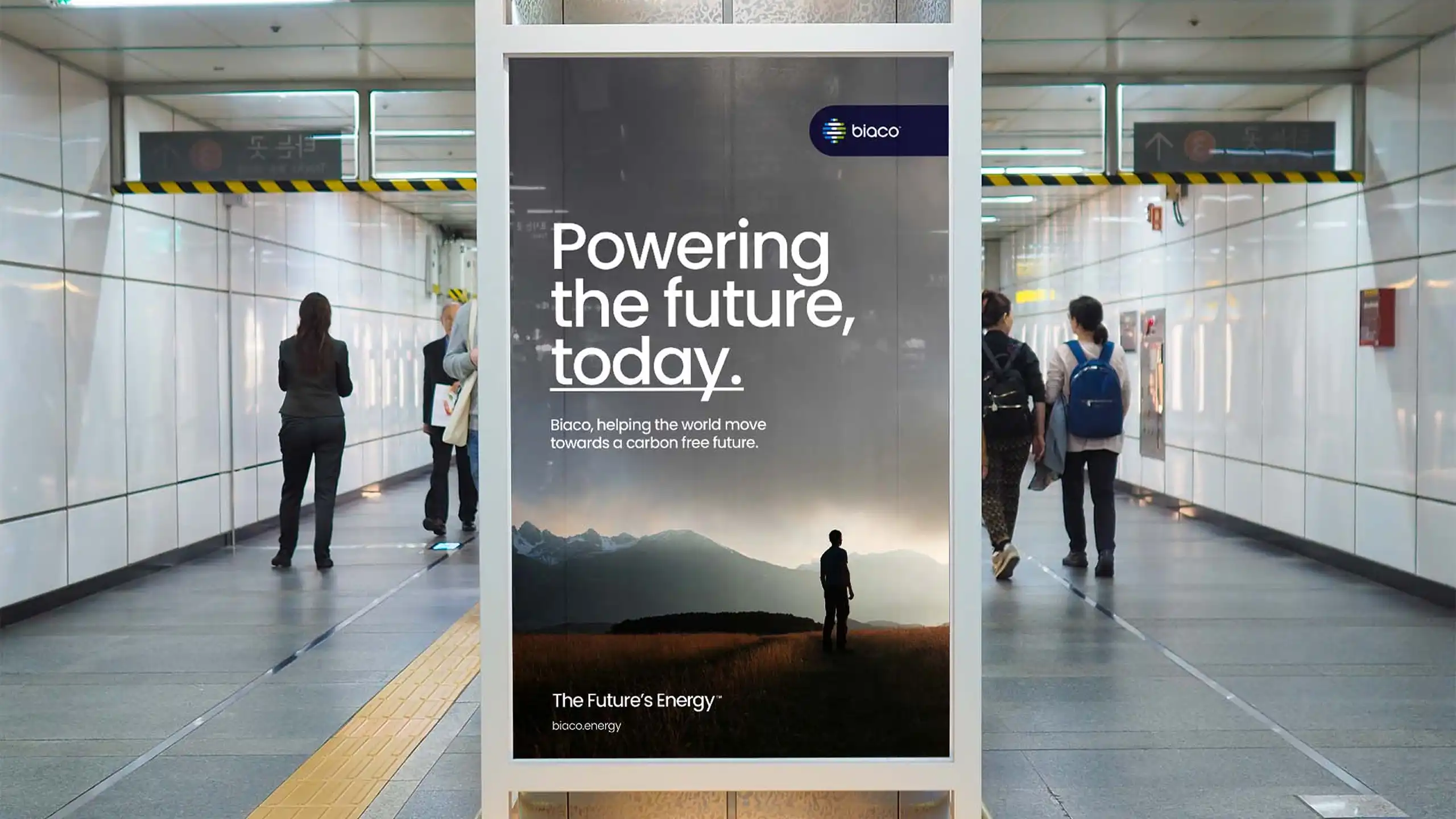
We began with strategy, defining a positioning centred on progress, optimism, and accessibility. The name Biaco was chosen for its simplicity, memorability, and ease across global markets — short, modern, and human. From there, we created a design system that reflected energy in motion: adaptable, forward-moving and engineered for scale.
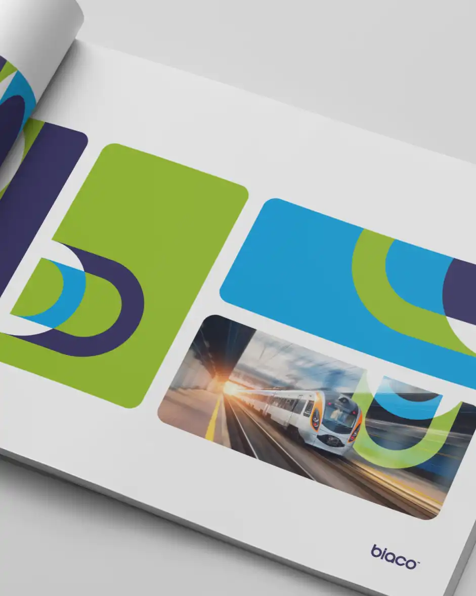
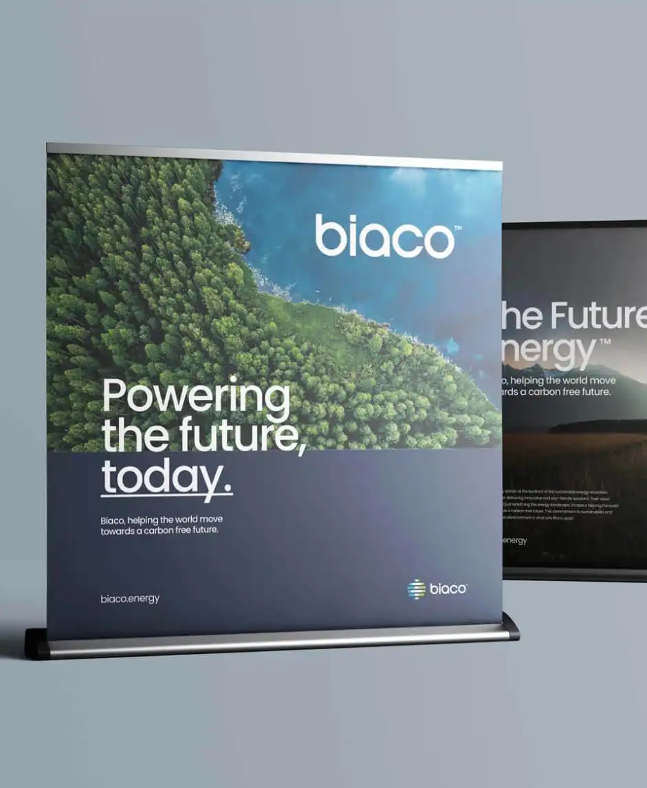
At the heart of the identity sits the Biaco symbol, a dynamic mark inspired by flow and transformation. It represents clean energy in transition, always evolving. The supporting palette moves beyond predictable eco-greens, balancing crisp blues and neutrals with subtle warmth to communicate innovation and trust.
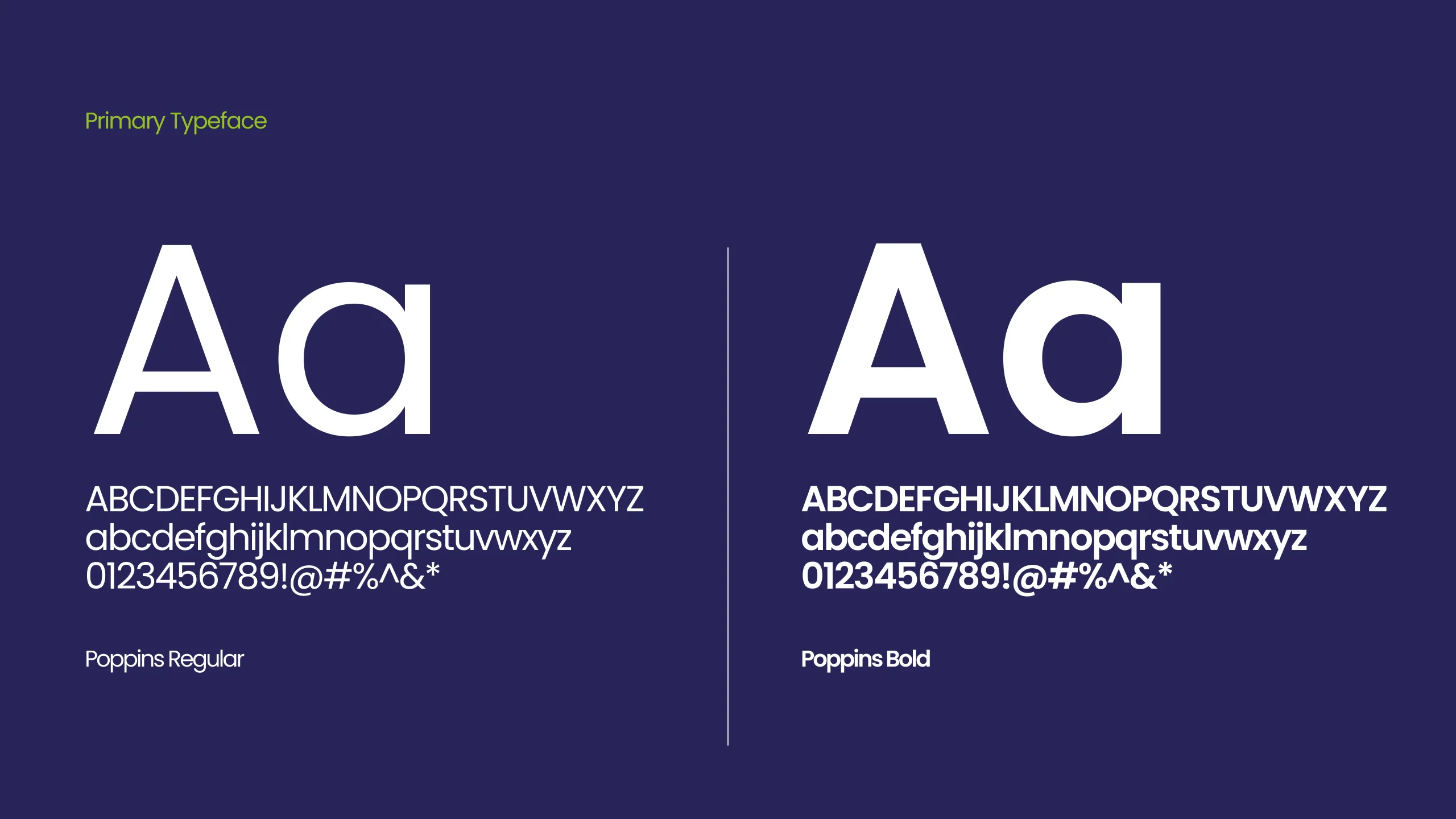
Typography and structure were selected for precision and clarity, giving Biaco a distinctive voice among overly technical competitors. The tagline, “The Future’s Energy™”, unites everything, a statement of intent that carries through every touchpoint.
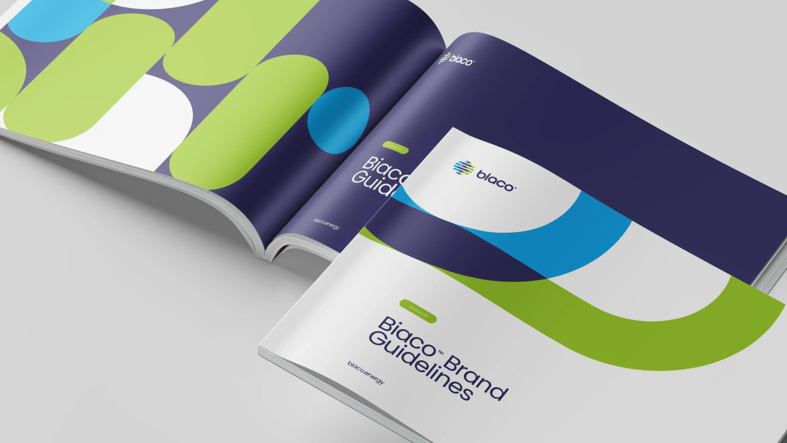
Finally, we delivered a comprehensive brand guideline system that goes beyond visuals, covering tone of voice, digital behaviour and real-world applications. Every element was designed for consistency, scalability and long-term growth.
The Result
The result was more than a visual refresh, it was the foundation for a business built to lead. The Biaco brand now stands as a credible, future-focused challenger in the clean energy market, combining innovation with clarity and confidence.
The new identity has given Biaco instant presence in a sector crowded with legacy utilities and emerging start-ups. From investor decks to digital communications, the brand system delivers consistency, flexibility, and impact.
Internally, it’s helped unify a growing team under one purpose-led vision. Externally, it’s given Biaco a clear, confident voice that reflects the strength of its technology and ambition.
For Crux, it was about more than building recognition, it was about creating a brand with meaning, momentum and the power to move an industry forward.
Gary Lutke
Director – Biaco Energy
“Crux brilliantly captured our vision, crafting a brand identity that resonates with our commitment to sustainable energy. Their expertise has been pivotal in positioning Biaco for future success.”
Got a project in mind?
Big or small, if it matters to you — it matters to us. Drop us a quick overview or just give us a call. We’ll take it from there.