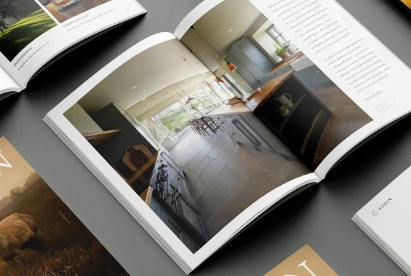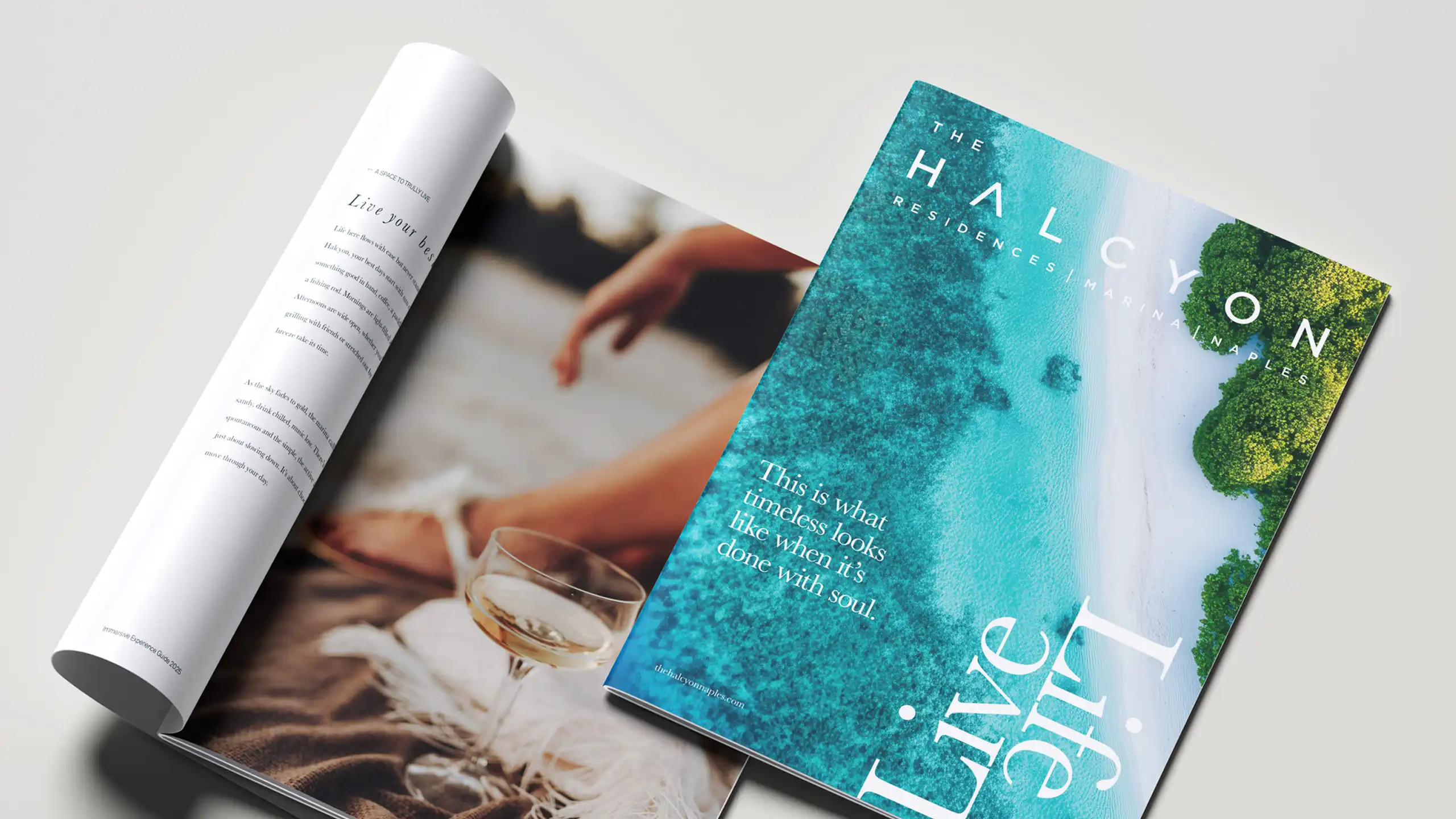
Good brochures are built on decisions, not decoration.
A brochure can look polished and still miss the mark. It can have strong typography, good imagery and a clean layout, feel considered, well-produced and on-brand, but still underperform where it matters most.
That usually happens because the problem starts earlier in the brochure design process. The content is unclear, the structure is unfocused, or the brochure’s purpose has not been properly defined. So while the design may look right, the brochure itself does not work hard enough.
At Crux, that is the pattern we see most often. Businesses assume they need better brochure design when, in reality, they need better brochure thinking. Once the brochure’s job becomes clear, the design has something solid to build on. Until then, it is mostly trying to compensate.
The brief often starts too late.
A lot of brochure projects begin with the same instruction:
“We need a new brochure”.
Sometimes the existing one feels dated, the brand has moved on, or the business has changed, and the old piece no longer reflects it properly.
All of that may be true. However, the project often starts at the visual end rather than the strategic one. The conversation quickly turns to page count, style, imagery, or whether the piece should be printed or digital. Meanwhile, the more important questions remain unanswered.
- Who is this brochure really for?
- What role does it play in the sales process?
- What does the reader need to understand quickly?
- What should they take away from it?
- What decision is it helping them make?
Without those answers, the brochure may still look good, but it will struggle to do its job.
A brochure is there to help someone move forward.
That is the point many teams miss. A brochure is not just a piece of branded collateral designed to fill pages, summarise everything or make the business look busy. Its job is to help someone move forward with confidence. Sometimes that means supporting a sales conversation, helping a buyer compare options after a meeting. or giving internal stakeholders something clear enough to share, discuss and come back to.
So the question is not simply what should go in the brochure. The better question is: what does this brochure need to help someone understand, believe or choose? Once you answer that, the rest becomes much easier.

More content rarely makes a brochure stronger.
When the purpose is unclear, businesses usually compensate by adding more. More services, features, paragraphs, credentials, pages, proof points and explanations. That instinct is understandable. Teams want to cover everything. They worry that leaving something out might weaken the piece. In practice, the opposite is usually true.
The more a brochure tries to include, the less clearly it tends to communicate.
Key messages lose impact. Hierarchy starts to collapse. Readers skim more, retain less and leave with a blurred impression rather than a strong one.
Good brochures do not try to say everything. They shape the message, guide attention and build around what matters most, which is where structure starts to matter.
Structure is what makes a brochure usable.
Before we get into design, we need to understand how the brochure is supposed to work. What needs to come through first, what needs backing up, and what is simply slowing the whole thing down?
Most people will not read it cover to cover. They will scan it, jump between sections and spend longer on the parts that feel relevant. The structure needs to make that easy.
That is where good brochure design earns its keep, not just in how it looks, but in how it guides someone through the content without making them work for it. Hierarchy, pacing and section logic all matter because they help people find their way through. More importantly, they help the message land.

The format should follow the job.
The print-versus-digital debate often pulls attention away from the more important question:
“How is the brochure actually going to be used?”
You may need a printed version for meetings, events or leave-behinds. You may also need a PDF for follow-up emails, internal circulation or sales teams to share more easily. In some cases, an interactive or web-based version may make sense. None of those formats is inherently better, as they serve different purposes.
So the starting point should not be format. It should be driven by function. Once you are clear on how you will use the brochure, making the right decisions becomes easier. You can see what the structure needs to do, what content matters most, and which format makes sense for the job. Without that, you are mostly guessing.
That is why print and digital are not really the issue. In most cases, they are just different ways the same brochure may need to show up.

Brochures still matter because the real decision usually comes later.
A brochure often proves its value after the meeting rather than during it. Someone forwards it internally. Someone reopens it before the next conversation. Someone else reviews it later, even though they were not in the room the first time.
In sectors such as B2B, property, healthcare and professional services, that is often where momentum either starts to build or quietly falls away.
The brochure is no longer just supporting a live conversation. It is helping people compare, share, revisit and make sense of the offer in their own time.
That changes what the brochure needs to do. It has to stand up on its own, guide people quickly without oversimplifying the message, and hold enough credibility to work even when nobody is there to explain it. That is what makes a brochure commercially useful.
Good design still matters, but it cannot rescue unclear thinking.
This is not an argument against design, far from it. Good design shapes perception. It sets the tone, builds trust and helps people move through information more easily. It gives a brochure pace, emphasis and clarity. When the foundations are right, it can elevate the whole piece.
The problem arises when the thinking underlying it is still vague. Sometimes the audience is too broad, the message tries to cover too much, or nobody has really decided what the brochure needs to do, so every page starts fighting for attention. That is when design gets pulled into the wrong role. Instead of sharpening something that is already well structured, it ends up compensating for a lack of focus.
The brochure may still look polished. It just will not work as hard as it should.
Getting the brochure design process right.
Most brochure projects need a clearer conversation before the design starts.
- Who is this really for?
- How will it actually be used?
- What decision is it helping move forward?
- What needs to land quickly?
- What needs more space?
- What can we lose?
- And what does success look like in practical terms?
Get that right, and the rest becomes much easier to shape. The structure gets clearer. The messaging gets sharper. The hierarchy starts to work harder. The piece becomes more focused, and the design has a clear purpose. That is the difference between a brochure that looks finished and one that actually works.

The real job of brochure design.
At Crux, we do not treat brochure design as a finishing touch. We see it as a thinking job first. The visuals matter, of course. However, they work best when they are built on clear decisions about purpose, audience, structure and flow.
That is what gives brochure design substance, making it more useful and more persuasive. Because the strongest brochures do more than present information attractively. They make the business easier to understand, easier to trust and easier to choose.
If your current brochure is not working as hard as it should, get in touch and we can help you look at what is holding it back.