Client: KBO
Industry: Fire & Security
Sector: B2B | B2C
Overview
Protecting your world™
KBO Fire & Security is a modern family-run business at the forefront of security technology, offering services to homeowners and companies countrywide. They provide high-quality, independent advice and reliable work blended with unbiased product recommendations and systems advice to all their customers.
Deliverables
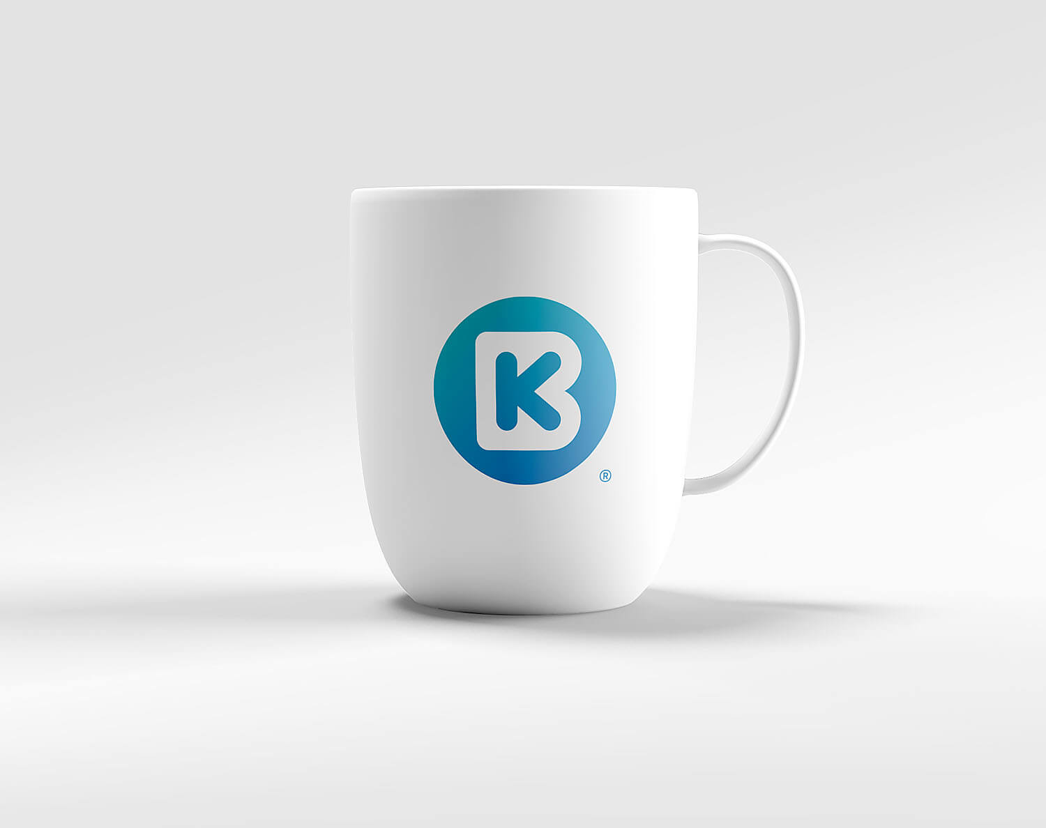
- Brand Identity
- Logo Design
- Brand Implementation
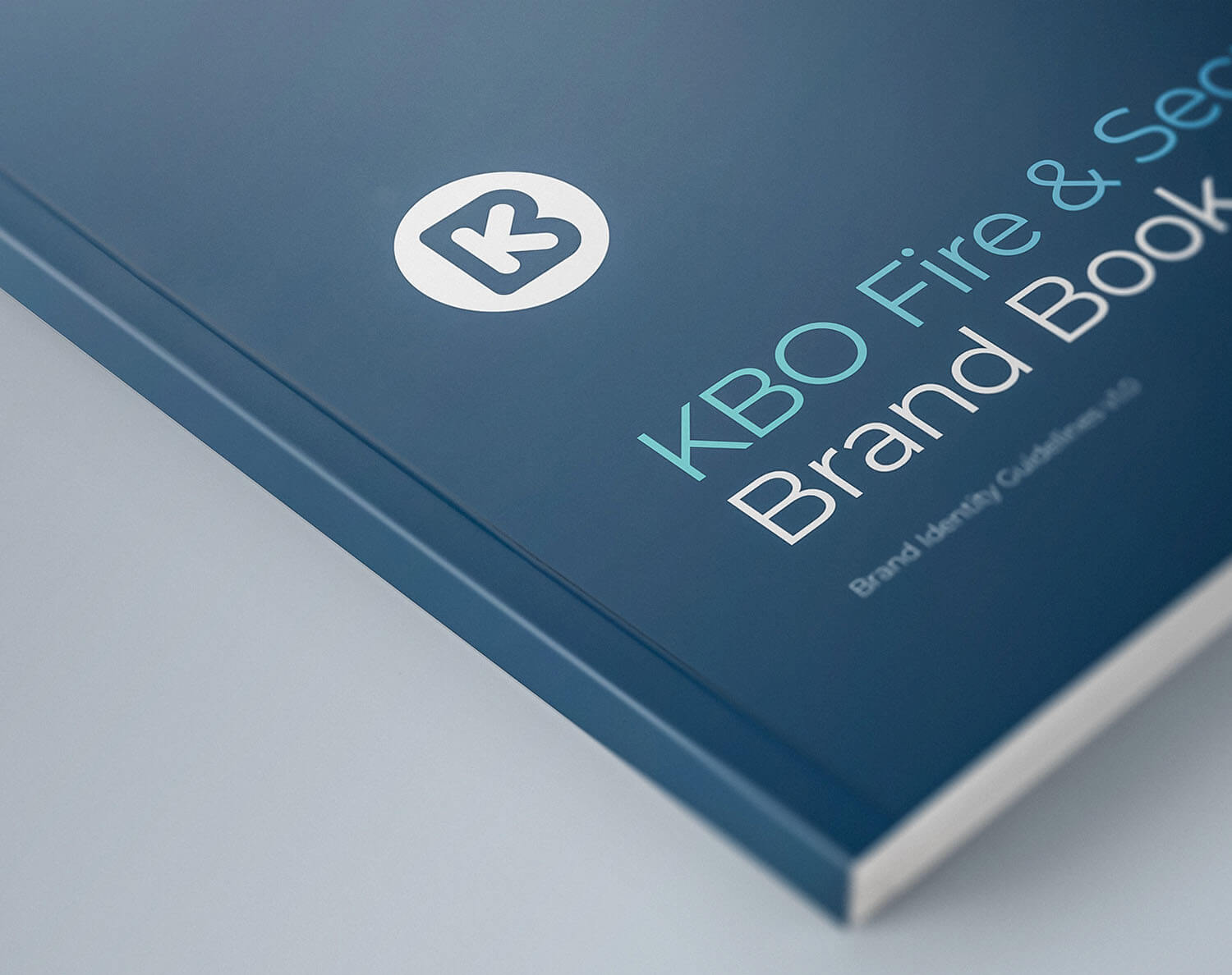
- Brand Guidelines
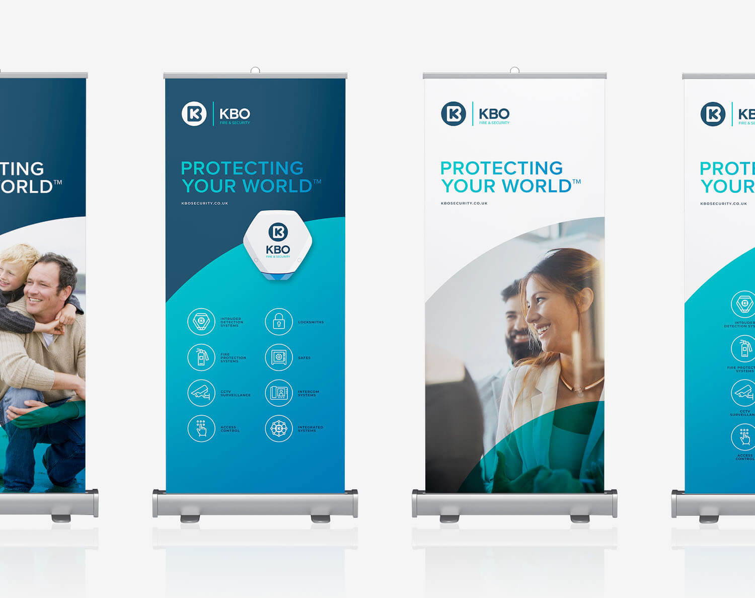
- Corporate Literature
- Sales & Marketing Literature
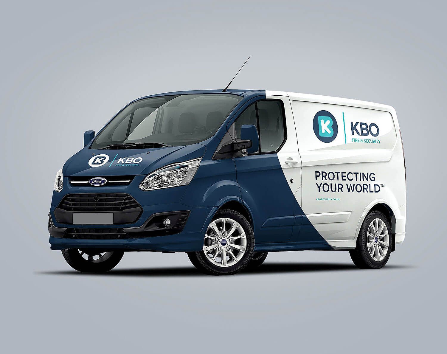
- Environmental Branding
- Vehicle Livery
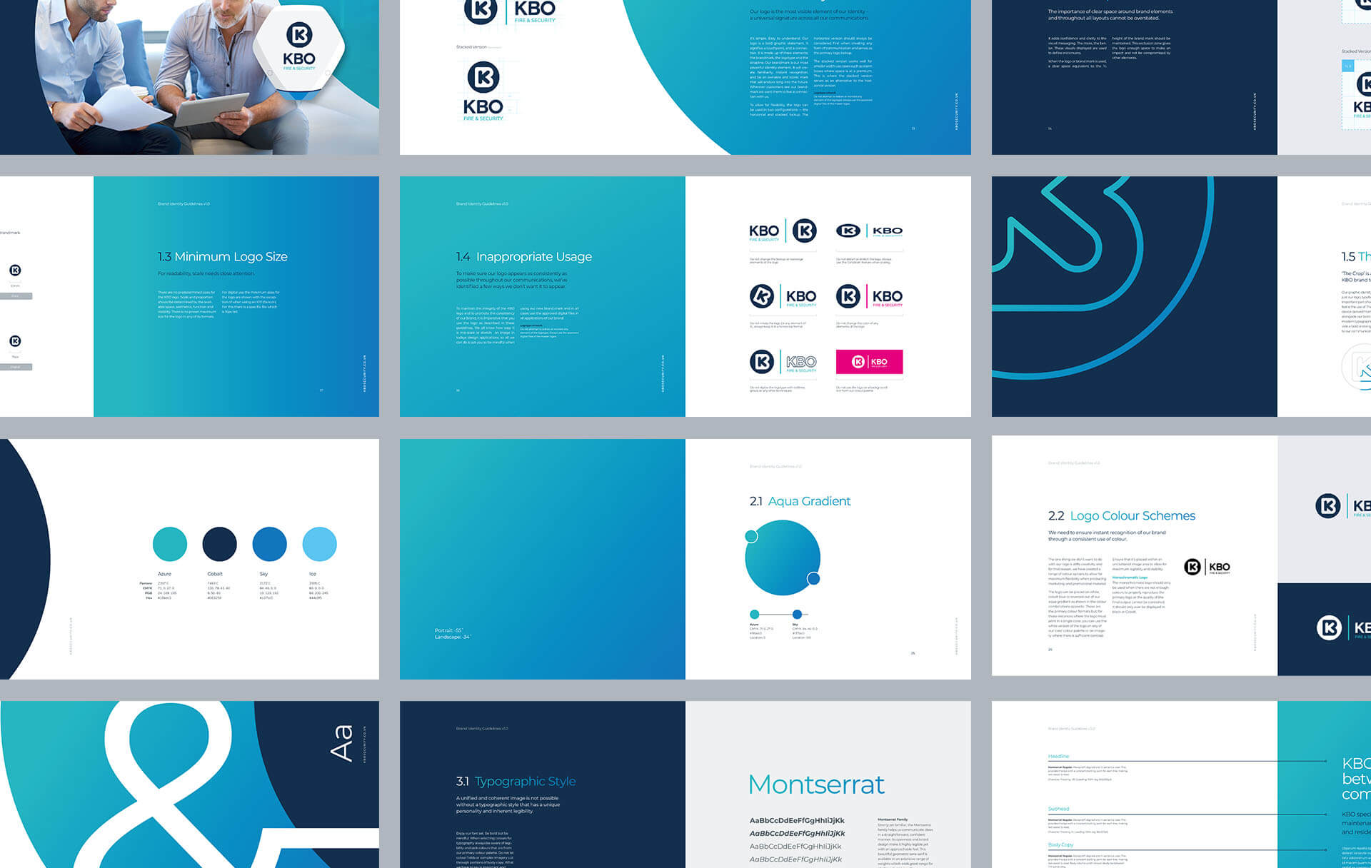
KBO appointed us as brand partners to help transition the business to the next generation of management and reposition them as market leaders in their sector. This project was a full-scale refresh. We oversaw the entire rebrand process, managing all stakeholders and suppliers, enabling the smooth implementation of all communications across print and digital media.
Working collaboratively with the KBO team, we reviewed the requirements and positioning for their new identity while retaining the essence of the original brand. We created a refreshed, contemporary, and confident new brand and were responsible for evolving the identity across the whole business.
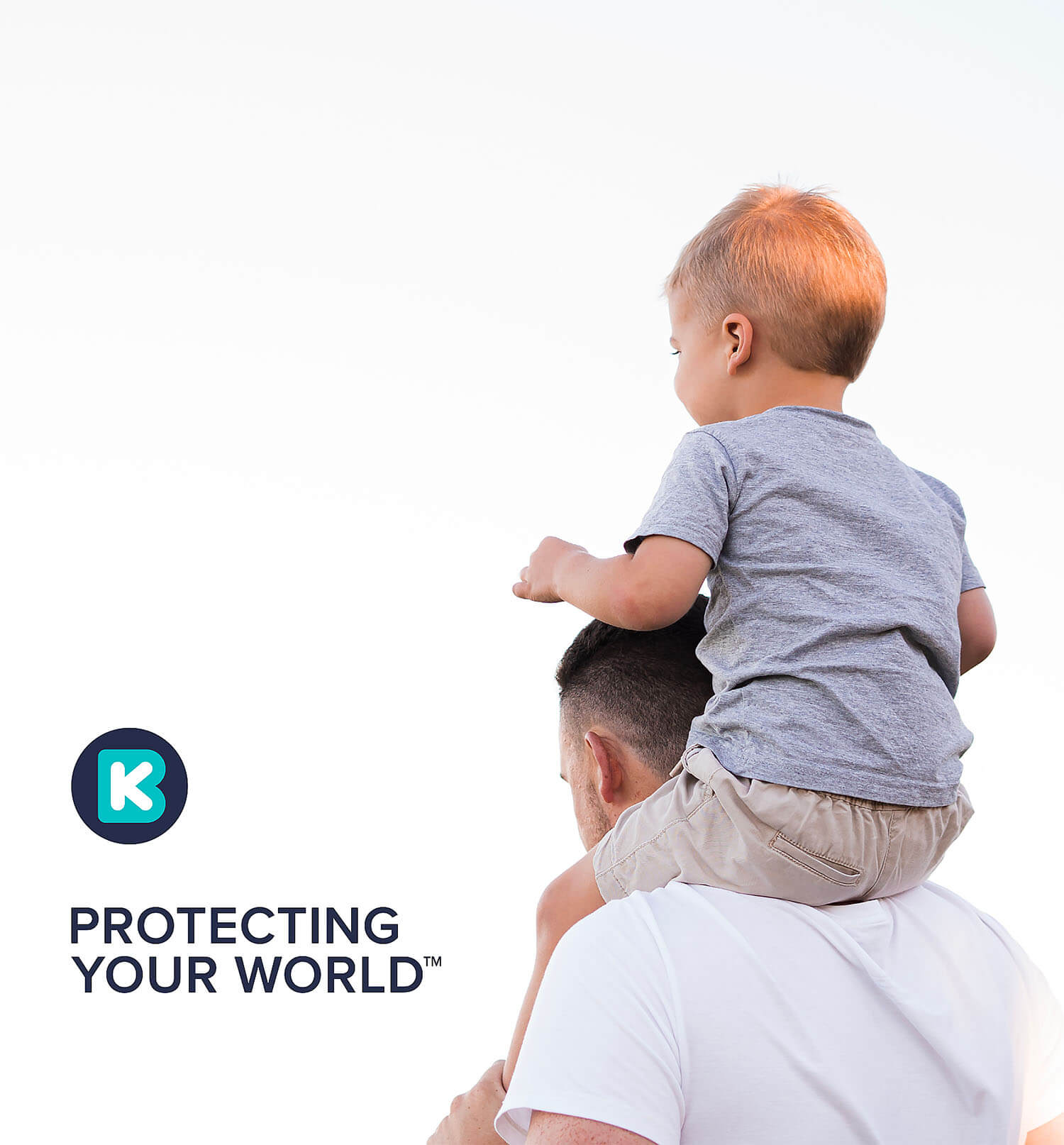

KBO was a well-established and well-respected company but looked tired and outdated. The new brand identity has elevated their business and put them ahead of their competitors, positioning them as one of the country’s leading fire and security companies. The perception shift due to the rebrand has opened doors to customers that previously wouldn’t have been possible. The outcome is a new look that is clean and recognisable, signifying togetherness, integration, and security – everything KBO represents as a business.
The new strapline, “Protecting your world,” encapsulates KBO’s vision for the business and has been delivered consistently across all brand communications and customer touchpoints. This was a gratifying and rewarding project to work on, where you know everything you’ve created will have a massive impact on the business.
We are delighted with the new identity created by Crux. It’s impactful and dynamic yet still retains our company heritage. The reaction from colleagues and customers alike has been beyond our expectations.
Lee Berry
Managing Director
Got a project in mind?
Big or small, if it matters to you — it matters to us. Drop us a quick overview or just give us a call. We’ll take it from there.