Client: Giganet
Industry: Communications
Sector: B2C & B2B
Overview
Full fibre. Honestly™
Giganet, a leading full fibre provider, is reshaping the UK broadband sector with a strong commitment to superior service and customer experience. Their aim is simple – to be the best and most trusted ISP in the UK offering full fibre, without the faff. They stand out by offering ultra-fast broadband that’s efficient and straightforward, aligning cutting-edge technology with a customer-first approach. In an industry often marred by subpar service, Giganet sets a new benchmark by ensuring high-speed, dependable internet without the hassle, embodying a partner rather than just a provider.
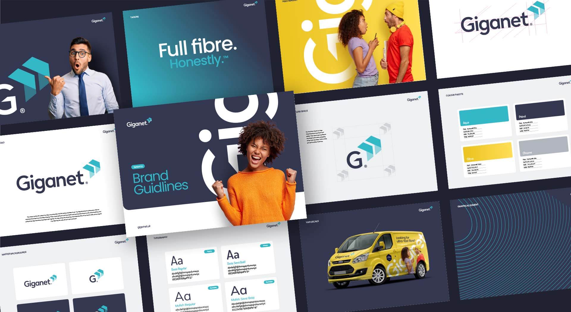
Deliverables
- Brand Audit
- Brand Identity
- Logo Design
- Brand Guidelines
- Web Design
- Merchandise Branding
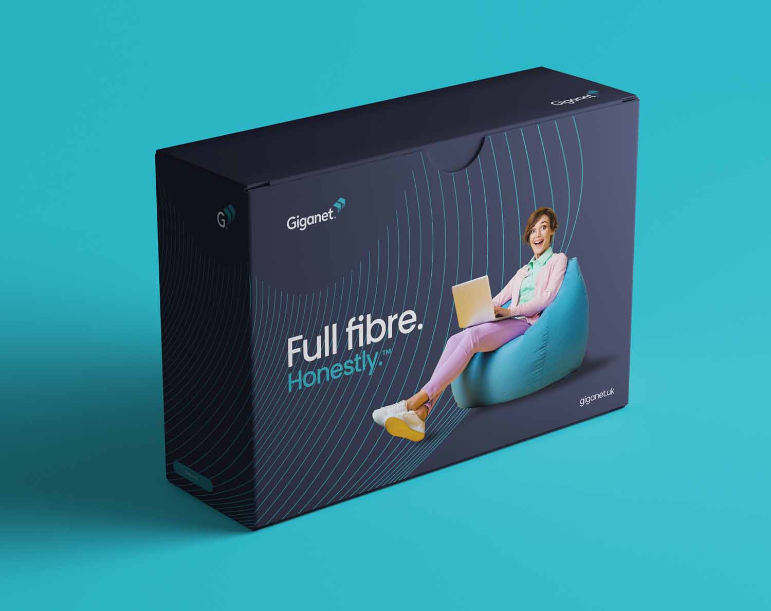
- Packaging
- Vehicle Livery Branding

When Giganet, a premier full fibre internet provider in the UK, engaged with Crux Design Agency, their goal was clear: to become the most trusted ISP in the UK, delivering full fibre without unnecessary complexity. This vision laid the foundation for an extensive brand refresh project, aimed at establishing Giganet as a leader in the broadband sector.
Our partnership with Giganet embarked on a dynamic brand refresh, aiming to infuse new life and vibrancy into their brand. This transformation went beyond mere aesthetics; it strategically aligned Giganet’s visual identity with their core values and market goals.
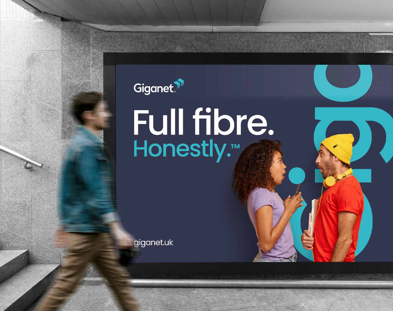
The creation of a bold and contemporary visual language was central to our approach. A vibrant colour scheme was selected to reflect Giganet’s dynamic spirit, symbolising the speed and reliability of their services. Paired with bold photography, the brand now exuded modernity, confidence, and a customer-centric ethos.
Read More
Typography played a vital role in the brand’s transformation. We designed custom typography for Giganet’s logo, cleverly using the angles from the brand’s icon to create a unique and clever logotype. This design choice was more than a stylistic preference; it underlined the brand’s uniqueness and commitment to innovation. Our work extended to developing new brand guidelines that meticulously defined the brand’s tonal and visual style. These guidelines ensured a consistent and impactful brand presence across all customer interactions, embodying Giganet’s values in every detail.
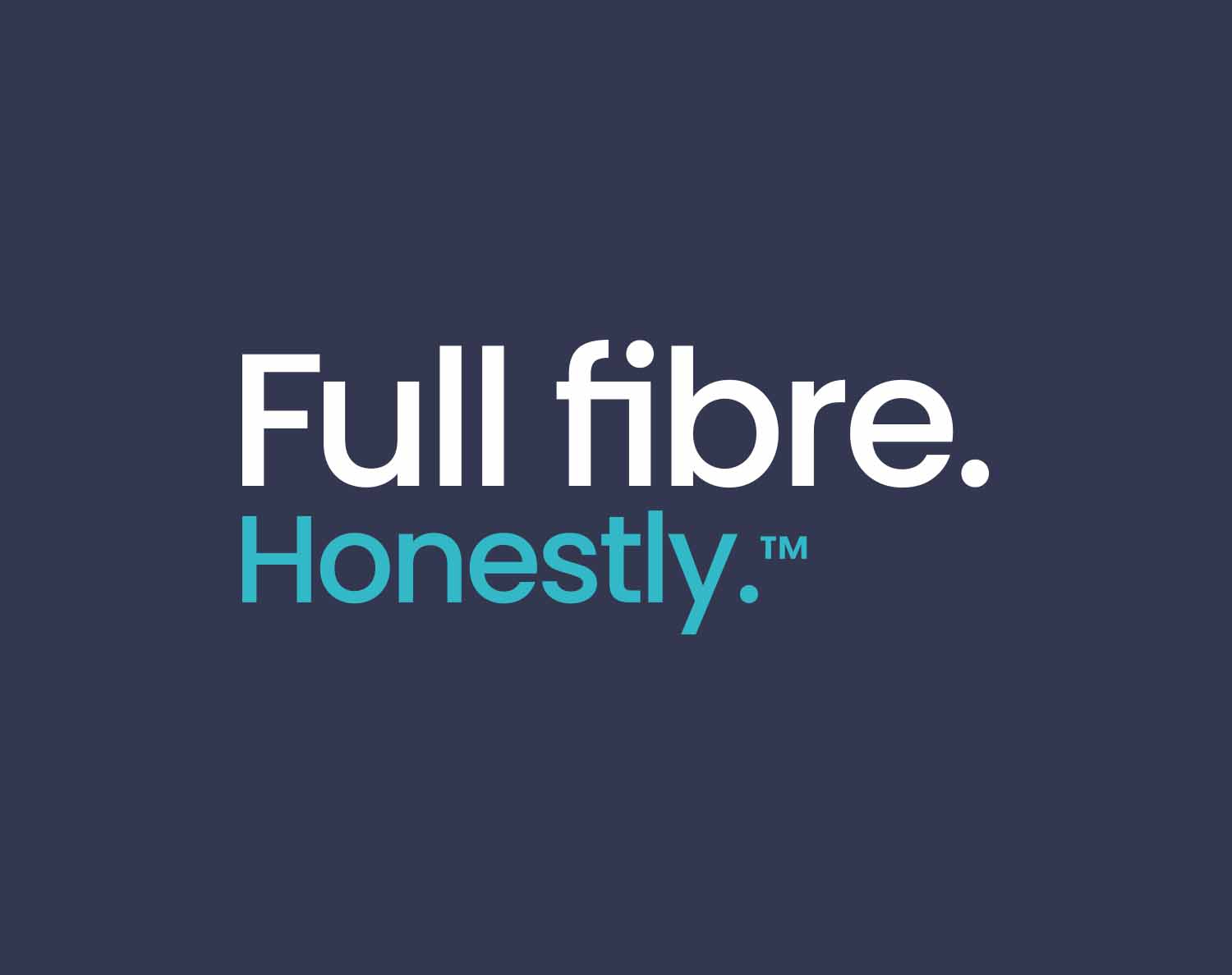
The new tagline, “Full Fibre. Honestly,” was a significant addition to the brand refresh. This tagline encapsulated Giganet’s commitment to providing straightforward, no-fuss broadband service, quickly becoming a fundamental part of the brand’s identity.


A key milestone in our project with Giganet was the comprehensive redesign of their website, focusing on creating a user-centric and visually engaging online experience. Our design approach involved crafting distinct sections for consumer and business audiences, each meticulously styled with specific visual elements, imagery, and colour palettes. This design strategy not only enhanced the site’s aesthetic appeal but also ensured that the messaging was tailored and relevant to each segment of Giganet’s audience. The overall visual transformation of the website played a crucial role in reinforcing Giganet’s brand promise of efficiency and reliability, mirroring their commitment to providing exceptional broadband services.
Merchandise branding also played a key role in bringing the refreshed brand identity to life. Each item was thoughtfully designed to reflect Giganet’s ethos, acting as a tangible ambassador of their commitment to quality and customer satisfaction. The redesign of Giganet’s vehicle fleet marked a key extension of the brand rollout. These vehicles, transformed into eye-catching mobile advertisements, prominently featured the new vibrant branding. With the refreshed colour scheme and bold typography, each vehicle effectively communicated Giganet’s innovative spirit and commitment to quality service. This strategic visibility on the roads significantly enhanced Giganet’s market presence, making every journey a testament to their dynamic brand identity.
In summary, Giganet’s brand refresh represents a holistic transformation. Now, Giganet stands as a distinguished player in the broadband sector, with a brand identity that’s not only visually appealing but also deeply ingrained with their values of honesty, simplicity, and top-notch service. This transformation exemplifies Crux’s dedication to creating brand solutions that resonate deeply with the audience and catalyse business growth, positioning Giganet as the epitome of hassle-free, full fibre internet service.
“Crux has worked with us to develop our Giganet brand and the design and development of a number of our websites. Each with its own unique brand identity and functionality, they always ensure slick and eye-catching creative. They’re a pleasure to work with and we’d highly recommend Crux for anyone looking for a new site or brand.”
Ruth Martin
Marketing Manager – Giganet

Got a project in mind?
Big or small, if it matters to you — it matters to us. Drop us a quick overview or just give us a call. We’ll take it from there.