Client: Henley Investments
Industry: Real Estate Investment
Sector: B2B
Overview
The trusted home for capital, known for smart investing™
Henley is an international investment and fund management firm focusing on private equity real estate, deploying both institutional and private investor capital. Henley’s diversified investments span the risk/return spectrum, including opportunistic, value add, core plus and core strategies. Henley has grown exponentially over recent years, resulting in the company evolving and diversifying its investment strategies.
Deliverables
- Brand Audit
- Brand Identity
- Logo Design
- Brand Strategy
- Brand Guidelines
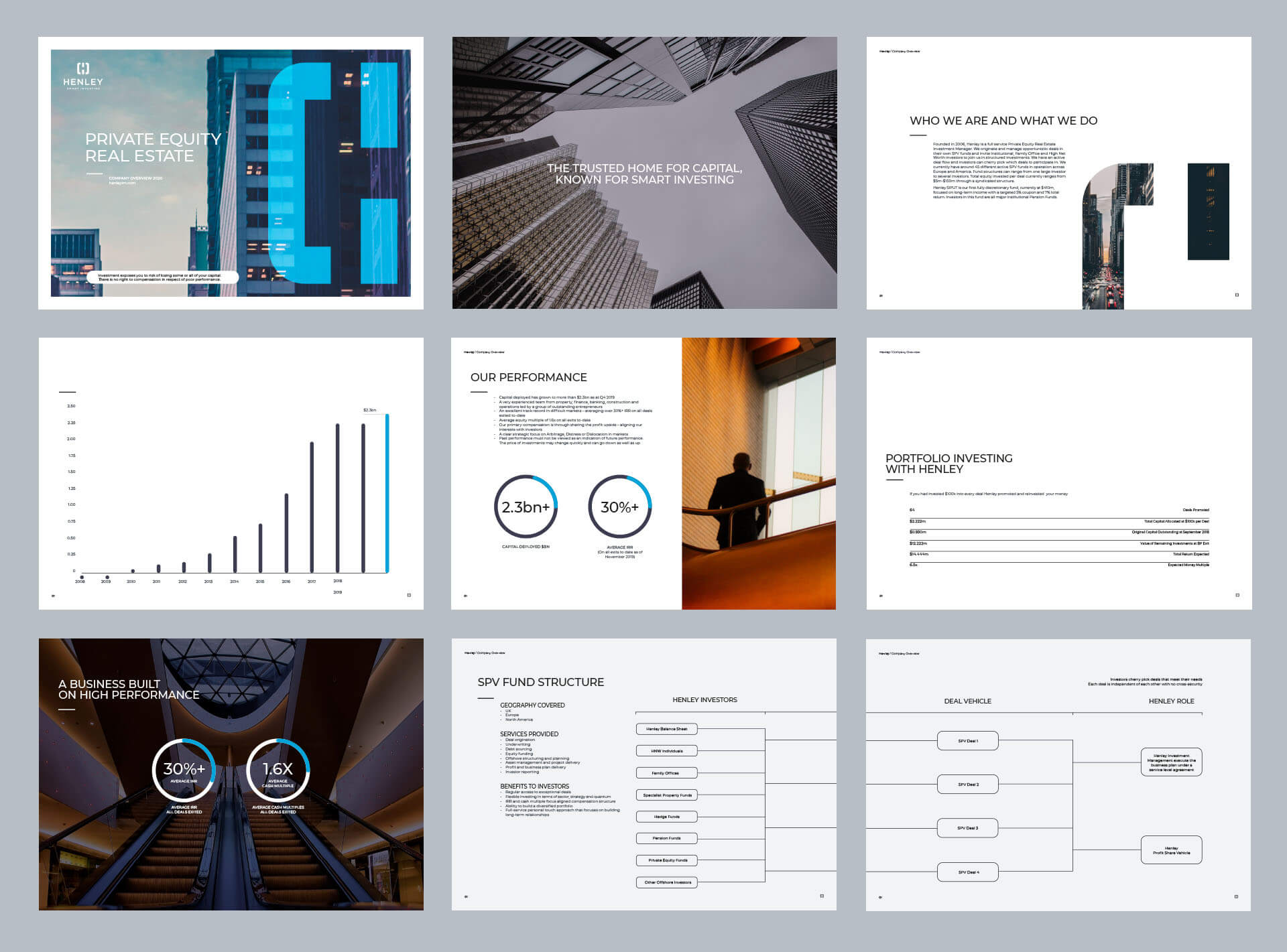
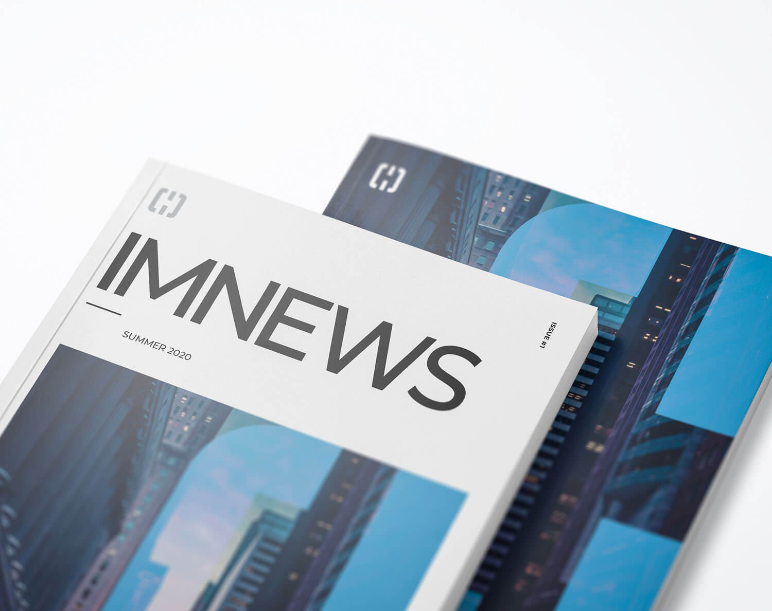
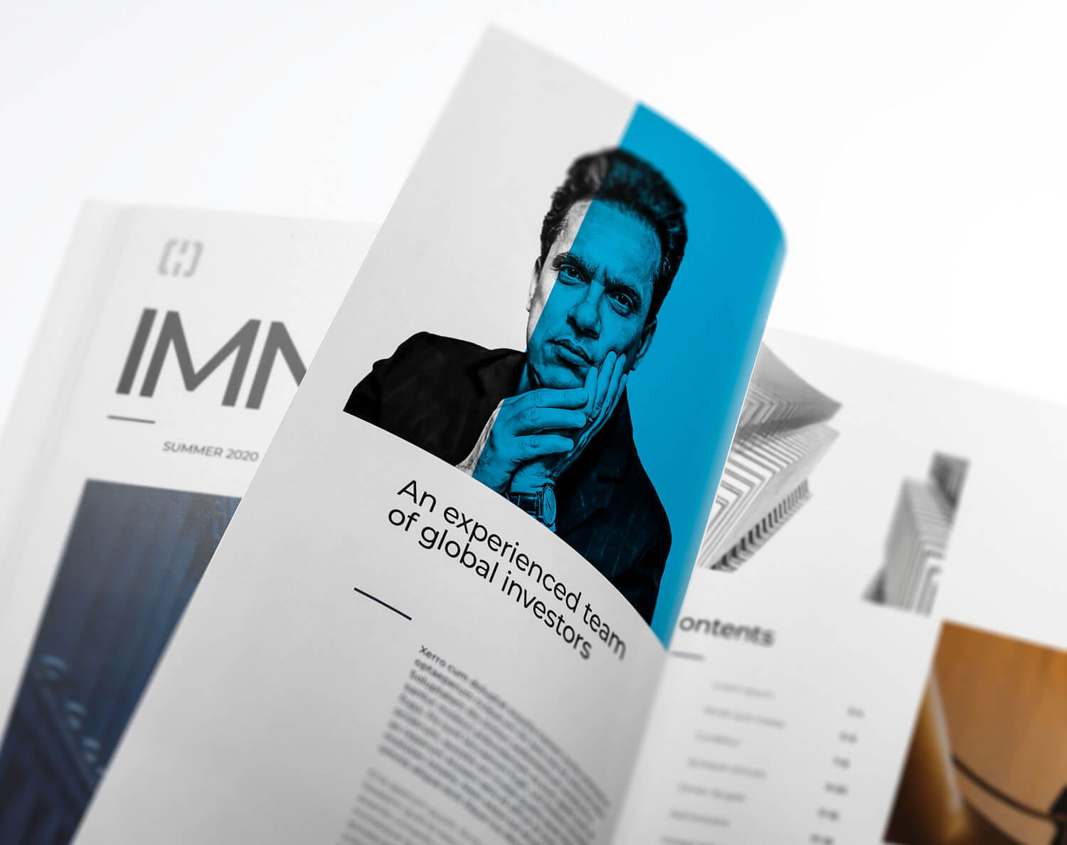
- Corporate Literature
- Sales & Marketing Literature
- Environmental Design
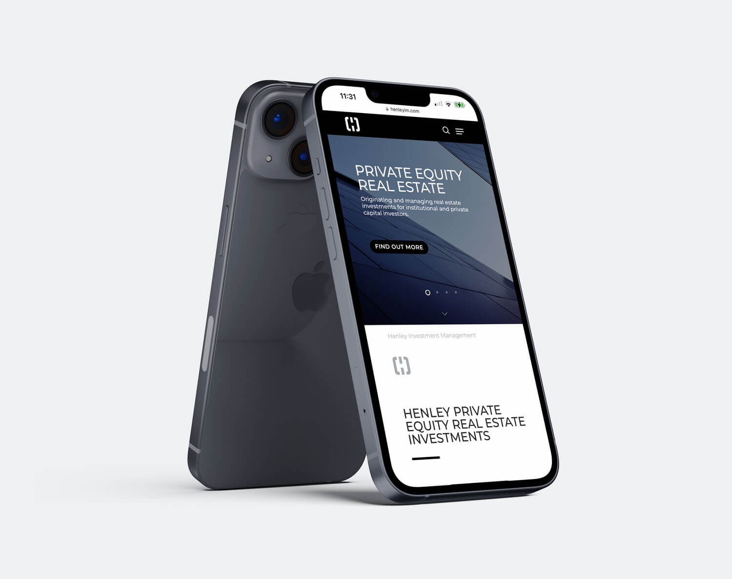
- Web Design
- Web Build
- Photography
As long-term brand partners of Henley, we were asked by the CMO to rebrand the business. Having successfully rebranded Henley five years previously, the identity had already accrued considerable brand equity. The business was well-recognised as a major player within their industry vertical. It wasn’t about throwing out the baby with the bathwater; it was about repositioning the company using visual styling and verbal messaging.
The great thing about Henley is that they push boundaries; they’re disruptors, movers and shakers. As designers, this suits us down to the ground; we can let go, nothing is off the table, and everything’s up for discussion.
Working with the Henley team, we found new energy, which was infectious and led to a dramatic visual shift in the business.
The iconic Henley brand mark, the ‘lock,’ was the only thing that remained untouched. Every touchpoint, headline, and word was reworked, resulting in a bold new look. We rolled out the new rebrand across every touchpoint with an extensive range of internal and external marketing communications, including presentation decks, investor memorandums, quarterly reports, and pitch books. A post-Covid world meant reintroducing the humble business card, beautifully remastered using letterpress print, textured stocks, and foil blocking. We stripped the new website back to a more minimalistic look – punchy, engaging headlines written in a language that speaks to everyone.
The outcome is a hugely positive response from clients, stakeholders, and investors – striking and powerful imagery, contemporary and modern typography, and primary colours- an enormously enjoyable project.
“They just get it. How to listen to a client and hone a brief to be focused and on strategy. The quality of thinking and creativity in development of concepts and applications. Managing deadlines to ensure the project is delivered when its been promised. Maniacal pursuit of quality and best in class execution. Endless enthusiasm, commitment and energy and an ability to get all stakeholders to give outstanding service. The result? Let’s just say when the top 10 businesses in your global industry say ‘its the best they’ve seen’, it really doesn’t get any better. Crux are incredibly talented, hardworking, flexible, modest and an absolute pleasure to work with. I wouldn’t hesitate in recommending them without reservation.”
Emma Rickwood
CMO – Henley Investments
Got a project in mind?
Big or small, if it matters to you — it matters to us. Drop us a quick overview or just give us a call. We’ll take it from there.